

Every designer has experienced the same painful moment. You step back, look at your screen, and realise the layout is a mess. The colours argue, the spacing feels awkward, and the whole page looks nothing like the confident idea in your head. Bad design does not only happen to beginners. It sneaks up on talented freelancers and passionate hobbyists who genuinely know better. Understanding why this happens is the first step toward escaping the cycle.
The Myth of Natural Talent
Many designers believe professionals simply wake up with perfect taste. Social media feeds reinforce this myth by showing flawless mock-ups without the ugly drafts behind them. The truth is that good designers produce bad work regularly. The difference is that they recognise it faster and fix it sooner.
Relying on talent alone leads to disappointment. Design is less about magical inspiration and more about repeatable decisions. When freelancers forget this, even strong skills can collapse under pressure.
Clients Make Designers Forget the Basics
Freelancers often start a project with solid intentions. Then the client requests a bigger logo, brighter colours, and more information on the homepage. One small compromise follows another until the original structure disappears.
Trying to please everyone is a common trap. Good designers suddenly create bad layouts because they stop defending fundamental principles. The problem is not the client but the designer’s fear of saying no.
Trends Are a Dangerous Shortcut
Trends promise quick success. A new gradient style or animation technique looks exciting, so designers copy it without asking whether it suits the project. What works for a tech start-up may ruin a local accounting website.
Chasing trends disconnects design from purpose. Freelancers wake up months later with a portfolio full of dated experiments and wonder what went wrong.
Overthinking Kills Simple Ideas
Hobbyists often ruin good concepts by adding too much. The first version is clean and clear, but doubt creeps in. Maybe another font would look better. Perhaps an extra icon will help. Soon the page resembles a crowded garage sale.
Professionals learn that the best improvement is often removal. Bad design frequently happens not from lack of ideas but from too many of them fighting for attention.
Designing Without Content Is Guesswork
A classic mistake is building beautiful layouts before real text exists. Designers fill boxes with placeholder words and imagine the rest will fit later. When the client finally provides content, everything breaks.
Good designers turn bad when they treat content as decoration instead of the main event. Words should shape the layout, not squeeze into it like reluctant passengers.
The Comfort Zone Problem
Freelancers develop habits that feel safe. They reuse the same structure, colours, and fonts because previous projects worked. Over time this comfort zone becomes a cage.
Bad design appears when designers stop questioning their routines. What once felt professional begins to look lazy, yet the creator does not notice until someone else points it out.
Technology Can Betray You
Modern tools are powerful but dangerous. Page builders offer hundreds of effects at a single click. Hobbyists assume more features equal better design and sprinkle them everywhere.
The result is a slow, confusing website that looks impressive only to the person who built it. Tools should serve decisions, not replace them.
Feedback Hurts but Saves Projects
Designers often avoid criticism because it feels personal. Freelancers working alone can go weeks without honest feedback. By the time someone finally comments, the project has drifted far off course.
Bad design survives in silence. Inviting early opinions from friends or colleagues can feel uncomfortable, yet it prevents bigger embarrassment later.
Deadlines Create Design Amnesia
Under tight deadlines even experienced designers forget what they know. Instead of following a process, they jump straight into decoration. Shortcuts replace structure and the result shows it.
Time pressure does not reduce the need for fundamentals. It increases it. A simple grid and clear hierarchy are lifesavers when the clock is ticking.
Ego Is the Quiet Villain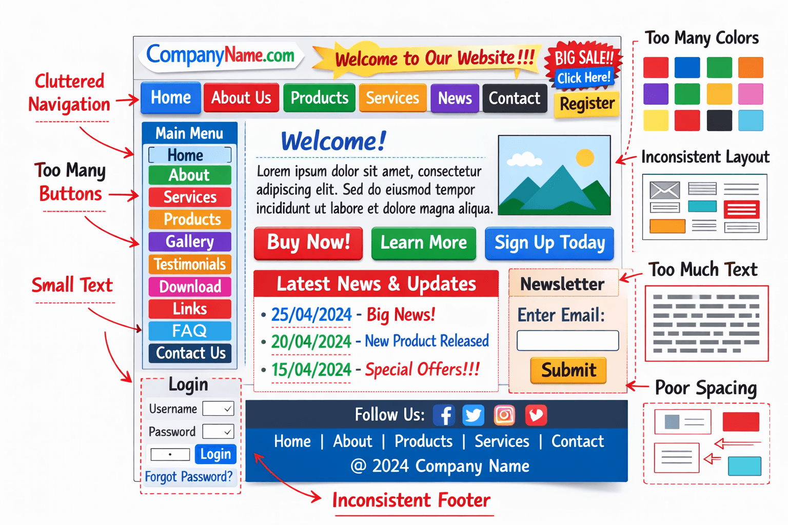
Design is personal, and ego easily sneaks in. Freelancers fall in love with clever details that users never notice. They defend poor choices because admitting mistakes feels like failure.
Letting go of ego is difficult but necessary. The goal is not to prove brilliance but to create something that works.
Multitasking Destroys Focus
Many hobbyists design while answering emails, watching tutorials, and scrolling social media. Creativity requires concentration, yet modern life encourages constant interruption.
Bad design often reflects a distracted mind. The solution is boring but effective: close the tabs, silence the phone, and give the project full attention.
Forgetting Who the User Is
Designers sometimes create for imaginary versions of themselves. They assume everyone understands jargon, enjoys tiny text, and has perfect eyesight. Real users are different.
When empathy disappears, good designers produce bad experiences. Remembering the actual audience keeps decisions grounded.
The Australian Government Digital Transformation Agency emphasises that effective digital services must be simple, clear, and focused on user needs to ensure people can complete tasks successfully. When designers lose sight of usability and clarity, even visually attractive layouts fail to perform their purpose.
How to Rescue a Failing Design
The fastest cure is to return to basics. Rebuild the layout on a simple grid, reduce fonts to two families, and increase contrast. Remove half the elements and see what remains essential.
Another trick is to step away for a day. Fresh eyes reveal problems that felt invisible before. Most disasters shrink when viewed after a short break.
Building Habits That Prevent Trouble
Professionals rely on checklists rather than mood. They confirm hierarchy, alignment, spacing, and accessibility before adding style. These habits protect freelancers from their own impulses.
Hobbyists can adopt the same discipline. Good design is less about genius moments and more about reliable routines.
Laugh at Mistakes and Keep Designing
Every portfolio hides embarrassing projects. Instead of feeling ashamed, treat them as teachers. Bad design happening to good designers is not a scandal. It is part of growth.
The goal is not perfection but progress. Each mistake clarifies what to avoid next time.
Bad design does not mean you are a bad designer. It means you are human, juggling clients, trends, tools, and deadlines. Recognising the traps allows freelancers and hobbyists to escape them and return to solid fundamentals.
If you want practical guidance and real-world feedback to strengthen your design process, Gold Coast Websites can help you turn frustrating projects into confident, professional results.
Frequently Asked Questions
1. Why do good designers sometimes produce bad designs?
Good designers can produce bad designs when deadlines, client changes, trends, or lack of feedback interfere with the design process. Even experienced designers can lose focus on core principles such as hierarchy, clarity, and usability.
2. How can designers avoid common design mistakes?
Designers can avoid mistakes by following a structured workflow that includes defining the problem, working with real content, using grids and hierarchy, maintaining consistency, and testing layouts with real users before finalising the design.
3. Why is user-focused design important?
User-focused design ensures that websites and visual content are easy to understand and use. When designers prioritise usability, visitors can navigate quickly, read information clearly, and complete tasks without confusion.
4. How do design trends affect freelance designers?
Design trends can inspire creativity, but relying on them too heavily can lead to designs that feel outdated quickly or do not suit the client’s goals. Successful designers adapt trends carefully while maintaining usability and brand consistency.
5. What is the best way to fix a bad design?
The fastest way to fix a failing design is to return to the fundamentals. Simplify the layout, use a clear grid, reduce the number of fonts and colours, improve contrast, and remove unnecessary elements that distract from the main message.