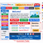

Great design often looks effortless, yet behind every strong layout sits a set of principles refined over decades. Graphic and web design students quickly discover that creativity alone is not enough. Professionals rely on consistent rules to organise information, guide attention, and communicate messages clearly. These golden rules form the foundation that separates attractive visuals from effective design.
Design Exists to Solve Problems
The first rule many students overlook is that design is not decoration. Every project has a purpose, whether to sell a product, explain an idea, or guide a user through a website. Colours, fonts, and images must serve that purpose rather than personal taste.
Professional designers begin by defining the problem before opening any software. Understanding the audience, the message, and the desired action shapes every later decision. When the goal is clear, the design gains direction.
This focus on usability reflects how critical design has become in everyday life. According to the Australian Government Digital Transformation Agency, government websites receive over 1.4 billion visits each year, meaning millions of people depend on clear, functional design to complete essential tasks. Poor design does not only look unprofessional, it creates real barriers for users trying to access important information and services.
Visual Hierarchy Directs the Eye
Visual hierarchy determines the order in which people see information. Larger elements attract attention before smaller ones. Bold colours stand out against muted backgrounds. Spacing tells the brain what is related and what is separate.
Without hierarchy, pages feel chaotic. Students often place everything at the same size, hoping the content will speak for itself. Professionals know that they must guide the viewer step by step from headline to supporting details and finally to the call to action.
Balance Creates Stability
Balance does not always mean perfect symmetry. It means that elements on a page feel stable rather than tipping to one side. Designers achieve balance by distributing visual weight through size, colour, and placement.
Asymmetrical layouts can be dynamic when balanced correctly. The key is to consider the entire composition instead of isolated parts. When balance is missing, even beautiful components appear uncomfortable.
Consistency Builds Recognition
Strong brands look the same across every touchpoint. Consistent use of fonts, colours, and spacing creates familiarity that users quickly recognise. In web design, consistent buttons and navigation reduce learning time.
Students sometimes experiment with different styles on each page, believing variety shows skill. Professionals understand that repetition builds trust and makes complex systems easier to use.
Contrast Brings Clarity
Contrast allows important information to stand out. Dark text on a light background, large headings above small paragraphs, and bright buttons against neutral sections all rely on contrast.
Low contrast is one of the most common beginner mistakes. Subtle grey text on white may look elegant on a designer’s screen but becomes unreadable for many users. Clear contrast respects accessibility and improves communication.
White Space Is Not Empty Space
New designers often feel the need to fill every gap. Professionals treat white space as an active element. Breathing room around text and images improves comprehension and gives designs a premium feel.
White space also groups related items naturally. A crowded page forces the viewer to work harder, while generous spacing allows information to be absorbed effortlessly.
Typography Communicates Tone
Fonts carry personality. A legal website demands different typography from a music festival poster. Choosing typefaces is not only an aesthetic decision but a strategic one.
The golden rule is restraint. Limiting a project to two or three font families maintains harmony. Attention to line height, paragraph width, and alignment turns ordinary text into readable content.
Alignment Brings Order
Invisible lines connect elements across a page. When objects align, the design feels intentional. When they float randomly, the layout appears amateur.
Grid systems help maintain alignment in both print and web projects. Students who learn to respect grids early find that their work improves immediately, even before adding complex visuals.
Colour Must Support Meaning
Colour influences emotion and behaviour. Warm tones can feel energetic, while cool tones suggest calmness. Professionals choose palettes that match the brand message rather than personal preference.
Using too many colours confuses the viewer. Limiting the palette to a primary colour, a secondary colour, and neutral tones keeps the design focused and recognisable.
Simplicity Outperforms Complexity
The golden rule heard in every studio is to remove what is unnecessary. Each element should justify its presence. If a graphic, line, or icon does not help the message, it distracts from it.
Simplicity does not mean dullness. It means clarity. The most memorable logos and interfaces are often the simplest because they communicate without noise.
Design for Real People
Professional designers test their work with actual users. What seems obvious to the creator may confuse someone seeing it for the first time. Observing real behaviour reveals weaknesses no theory can predict.
Students should develop the habit of seeking feedback early. Design improves through iteration rather than inspiration alone.
Function and Beauty Must Coexist
In web design especially, beauty cannot replace function. A stunning interface that loads slowly or hides navigation fails its purpose. Professionals balance aesthetics with performance and usability.
Understanding technology constraints is part of the craft. Images must be optimised, buttons must be touch friendly, and layouts must adapt to different screens.
Learn the Rules Before Breaking Them
Famous designers sometimes break conventions, yet they do so with intention. Students who ignore principles before mastering them usually create confusion instead of innovation.
Knowing why a rule exists allows designers to bend it wisely. Creativity grows stronger when supported by solid foundations.
Building a Personal Design Process
Golden rules become practical through a repeatable process. Professionals start with research, sketch rough ideas, apply grids and hierarchy, choose typography, and refine colour last. This order prevents style from overpowering substance.
Students who adopt a structured workflow progress faster than those who jump straight into effects and trends.
Lifelong Learning in Design
Design principles remain constant even as tools change. New software appears every year, yet hierarchy, contrast, and balance still guide successful work. Professionals continue studying these fundamentals throughout their careers.
The best designers stay curious, analyse other people’s work, and refine their understanding with each project.
The golden rules of design are not restrictions but tools. They help graphic and web design students transform creative ideas into clear communication. Mastering visual hierarchy, contrast, balance, and simplicity leads to work that serves both users and clients.
If you want to see how these principles apply to real-world websites and professional projects, Gold Coast Websites can help you explore practical design approaches that turn theory into confident, career-ready skills.
Frequently Asked Questions
1. What are the golden rules of graphic and web design?
The golden rules of design include understanding the problem before designing, using visual hierarchy, maintaining balance and alignment, applying strong contrast, using consistent styles, and keeping layouts simple and readable.
2. Why is visual hierarchy important in design?
Visual hierarchy guides the viewer’s attention through content in a logical order. By using size, spacing, colour, and placement, designers help users quickly understand what information is most important.
3. How does white space improve design?
White space improves readability and helps separate different elements on a page. It allows content to breathe, reduces visual clutter, and makes designs appear more organised and professional.
4. Why is consistency important in web and graphic design?
Consistency ensures that colours, typography, buttons, and layouts remain predictable across a project. This builds trust with users and makes websites easier to navigate.
5. Why should designers keep layouts simple?
Simple designs communicate ideas more clearly. Removing unnecessary elements improves focus, usability, and readability while helping users find information faster.