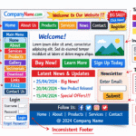

Strong front end development is one of the most important factors that shapes how visitors experience a website. When someone opens a site for the first time, they form an opinion within seconds. If the layout feels confusing, slow, or outdated, most users will leave and search for another option. This means that even if a business offers excellent services, poor design and weak user experience can still drive customers away.
Many people believe that improving a website requires a complete rebuild or expensive redesign. In reality, a few smart changes in front end development can dramatically improve how a site looks and performs. Professional developers often rely on simple techniques that enhance usability, clarity, and visual appeal. These front end tricks can instantly make a website feel modern, organised, and trustworthy.
This guide explains nine practical front end techniques that developers use to improve websites. These strategies can help businesses create better user experiences while also improving search visibility and engagement.
Why Front End Development Matters More Than You Think
Before exploring the specific techniques, it is important to understand why front end development plays such a critical role in website performance.
Front end development refers to the part of a website that users interact with directly. This includes layouts, navigation menus, buttons, images, forms, and text presentation. Every visual element that appears in the browser is created through front end technologies such as HTML, CSS, and JavaScript.
When front end development is done correctly, visitors can navigate a website easily. Pages load quickly, information is easy to read, and actions such as contacting a business or purchasing a product feel simple.
However, poor front end development creates frustration. Pages may appear cluttered. Text may be difficult to read. Navigation may be confusing. When users encounter these issues, they often leave immediately.
Improving front end development helps solve these problems and creates a more positive experience for visitors.
Trick 1. Improve Typography for Better Readability
Typography is one of the most overlooked elements in website design. Many websites fail simply because their text is difficult to read.
Visitors come to websites mainly for information. If reading the content requires effort, users will quickly lose interest. Good typography makes reading feel comfortable and natural.
Start by selecting fonts that are clean and easy to read on screens. Sans serif fonts are widely used because they display clearly on digital devices. Avoid decorative fonts for large sections of text.
Font size also plays a major role. Body text should be large enough for comfortable reading. Most modern websites use body text sizes between sixteen and eighteen pixels.
Line spacing is equally important. Proper spacing between lines improves readability and prevents paragraphs from feeling crowded.
When typography is clear and well structured, visitors stay longer and absorb information more easily.
Trick 2. Use a Consistent Colour System
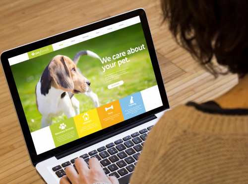
Colour plays a powerful role in how users perceive a website. Random or inconsistent colours often make a site feel chaotic.
A professional colour system usually includes one primary brand colour and one or two supporting colours. These colours are used consistently across buttons, headings, links, and highlights.
Consistency helps visitors understand which elements are interactive. For example, when all call to action buttons share the same colour, users quickly recognise where to click.
Colour contrast also matters for accessibility. Text should always stand out clearly from the background. Poor contrast can make reading difficult and discourage visitors from staying on the page.
When colour systems are applied consistently, the website feels organised and professional.
Trick 3. Simplify Website Navigation
Navigation is one of the most important components of front end development. A visitor should always understand where they are and how to reach the information they need.
Many websites fail because their menus are overly complicated. Too many links create confusion and slow down decision making.
A simple navigation menu works best. Most business websites only require a few main sections such as Home, Services, About, Blog, and Contact.
Dropdown menus can be useful for organising additional pages, but they should remain easy to understand.
Clear navigation improves usability and helps visitors explore the site with confidence.
Trick 4. Add White Space to Improve Layout
White space refers to the empty space between design elements. It is one of the most effective ways to improve visual clarity.
Many website owners attempt to place too much content on a single page. This results in cluttered layouts that overwhelm visitors.
White space allows the design to breathe. It separates sections and guides the eye naturally from one element to the next.
Major technology companies often rely on generous spacing in their designs. This approach creates a modern and premium appearance.
Even small adjustments in spacing can dramatically improve the look of a page.
Trick 5. Use High Quality Images
Images help communicate ideas quickly and create visual interest. However, low quality or irrelevant images can damage the credibility of a website.
Blurry or outdated photos make a site appear unprofessional. Visitors may question the reliability of the business behind the website.
Professional images help build trust and strengthen brand identity. Images should support the message of the page rather than distract from it.
It is also important to optimise image sizes. Large image files can slow down page loading speed, which affects both user experience and search visibility.
Balancing quality and performance is a key part of effective front end development.
Trick 6. Make Call to Action Buttons Clear
Every website should guide visitors toward specific actions. These actions may include requesting a quote, signing up for updates, or contacting a business.
Call to action buttons should be visually distinct. They must stand out clearly from surrounding content.
Using strong colours, clear labels, and generous spacing makes buttons easier to notice and click.
Button text should also be direct and specific. Instead of vague phrases such as click here, use action focused text such as contact our team or request a consultation.
Clear calls to action help convert visitors into customers.
Trick 7. Optimise the Mobile Experience
Mobile browsing now represents a large portion of internet traffic. Websites that are not mobile friendly risk losing many potential visitors.
Responsive front end development ensures that layouts adjust automatically based on screen size. Text remains readable, images resize correctly, and navigation remains accessible.
Mobile optimisation also improves search visibility because search engines prioritise mobile friendly websites.
Developers should always test websites on multiple screen sizes to ensure consistent performance.
Trick 8. Improve Website Speed
Page speed has a direct impact on user behaviour. Visitors expect websites to load quickly. If a page takes too long to appear, many users will leave before viewing the content.
Research from the Australian Government’s Digital Transformation Agency shows that users can form an impression of a website in as little as 0.05 seconds. This means even slight delays or visual issues can immediately affect how visitors perceive a business.
Improving speed involves several techniques. Image compression reduces file sizes. Efficient code reduces unnecessary scripts. Browser caching allows repeat visitors to load pages faster.
Search engines also consider page speed when ranking websites. Faster websites often perform better in search results.
Trick 9. Structure Content Clearly
Content structure plays a major role in how users read and understand information.
Headings should introduce topics clearly. Subheadings break information into sections. Paragraphs should remain short and easy to read.
This structure helps visitors scan pages quickly. It also helps search engines understand the main topics of the content.
Clear content hierarchy improves both usability and search performance.
How Front End Development Supports Business Growth
Strong front end development does more than improve appearance. It directly influences user behaviour.
When visitors find a website easy to use, they spend more time exploring the content. This increases engagement and builds trust.
Businesses with professional websites often see higher conversion rates. Clear design and smooth navigation encourage users to take action.
Investing in front end improvements helps businesses create better digital experiences for their customers.
Maintaining Long Term Website Quality
Websites should evolve as technology and user expectations change. Regular updates keep a site modern and competitive.
Developers often monitor user behaviour through analytics tools. These insights reveal which pages perform well and which areas need improvement.
Continuous improvement ensures that websites remain effective and user friendly.
Front End Development Improvements for Better User Experience
Front end development plays a critical role in shaping how visitors interact with a website. Simple improvements such as better typography, consistent colour systems, clear navigation, and faster loading speeds can transform the user experience.
Many businesses underestimate the impact of these small changes. However, improving usability and visual clarity can significantly increase engagement and trust.
If your website needs professional development support, the team at Gold Coast Website is ready to help. Our experts specialise in creating modern websites that are fast, visually appealing, and easy to use. Contact us today to discuss how we can improve your online presence and help your business grow.